Dialed In: A Conversation with Jim Phillips on the Screaming Hand, the Red Dot, and the New Remind Insoles x Santa Cruz Collab
For decades, Jim Phillips has been the creative force behind some of the most iconic graphics in skateboarding history. From the world-famous Screaming Hand to the timeless Red Dot, his work has helped define the visual identity of Santa Cruz Skateboards—and skate culture at large.
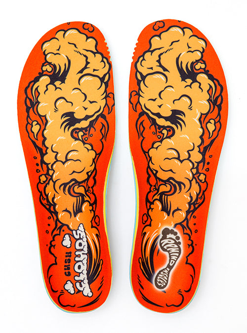
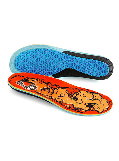
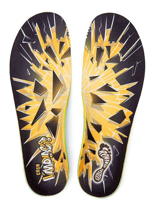
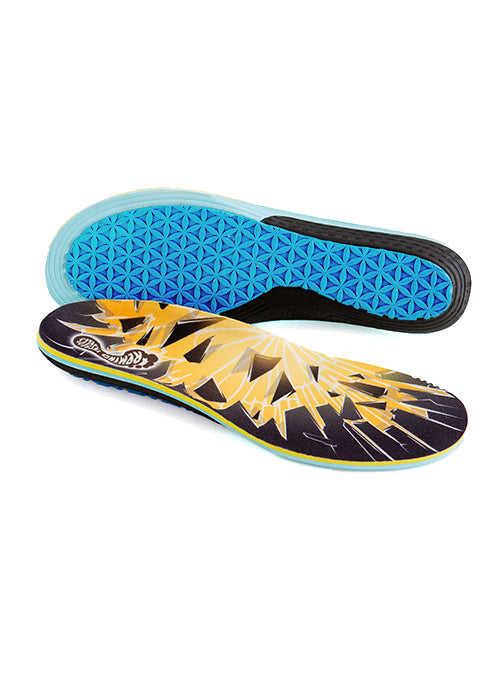
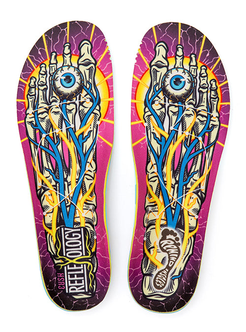
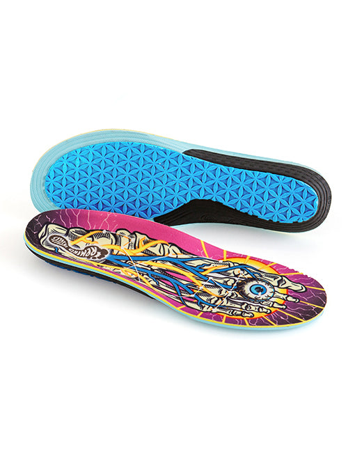
So when it came time for Remind Insoles to collaborate with Santa Cruz, we knew exactly where to turn. Our new collab insoles feature a bold mash-up of Phillips’ legendary imagery, including the Screaming Hand and Red Dot, reimagined for performance, comfort, and daily inspiration underfoot.
To celebrate the release, we caught up with Jim for a deep-dive into his early days as a young artist, how he broke into the skateboarding world, and what inspired the graphics that are now etched into the DNA of skateboarding. From his ink-stamped Remind logo to the emotional resonance behind a screaming blue hand, this conversation covers the past, the process, and the passion behind it all.

What initially inspired you to start drawing and how did you get pulled into the skateboard-art world?
My earliest days go back to about age 3 when I did my first drawing. There wasn’t much else to do. There was no television and we didn’t have much furniture—sometimes no furniture at all—and we had to move around a bunch. I went to eight different schools by the 2nd grade. We were moving every few months. So I had to find something to entertain myself with and that was the newspaper that was lying around with the comic section in it. And that was it for me. I would doodle away at the comics, I’d draw their comics, invent my own or whatever, and it greatly inspired me to draw. And then in school, since I was in and out of so many schools, I couldn’t keep up. But they give you a pencil and paper and I’d just draw. All through high school I kept drawing, and they’d just push me through, but I never did graduate. And that’s all part of the movie [Art and Life doc] and what happened to me, because it was really pretty devastating, but in a way it led to what I am. I couldn’t recommend kids not to go to school—I tell them to do the best they can—but that was the trap I fell into.
How did you end up doing art in skateboarding?
Well, the opportunity came up—it wasn’t something you could just establish yourself—but I started as a kid with old 2x4s with metal skates on them that I pulled off my sister’s roller-skates. They were just old pieces of wood, you know? There was no decorating, maybe you’d carve your name into it or something, but the Industry was far away. But some brands eventually became sophisticated enough to be screening their names on decks. I got a call from Santa Cruz and they wanted a logo to be screened onto their boards, wheels and everything else after that. I had a freelance art service that I started in 1971, and they were one of my calls. I knew Rich Novak and the other owners, old friends I knew from surfing, but they just called me up and wanted a logo. And the rest is history.

The graphics on our collaborative insole is basically a collage of some of your most iconic imagery. Can you give me some history behind the red dot and screaming hand? And the inspiration behind them.
The Red Dot is the famous Santa Cruz logo and was developed linear originally. Meaning Santa Cruz was linear together on one level. It was Jay Sherman, one of the owners of NHS—he’s the “S”—he was the one I was working with on graphics. I used to come in and we’d pin them on the wall, sit back and talk about them. It was great. So he looked at the logo and goes, “You know Jimmy, I just see it.” And he’d do that a lot [laughs]. But he really could. “I just see a Red Dot.” And I said, “Sure how hard is that to do? Put a red dot behind it?” So we did that and it’s been really well-received by the public. I mean, it’s around the world, and really represents something to a lot of people. Some of the visitors that we get from overseas tell us, “We didn’t realize Santa Cruz was a town.” So this is the town and this is the town logo. They’ve tried to make new ones but nothing sticks. Everyone who comes to town has to get the red dot. So that’s a lot of fun.
The Screaming Hand came along later. Santa Cruz wanted a logo for the Screaming Hand wheel line. So I developed the Screaming Hand for that. It started back when I was in high school drawing surfers with a big wave and a goofy guy coming down the way and around him there’d be sight-gags that you see with your eyes—like a shark fin, or a hand sticking out like a drowning guy, it was just funny stuff. But I liked that hand sticking out. I’d draw it on all my notebooks and it became kind of an image for me. 20 years later when they asked me for this Speed Wheels logo it just came to me, like yeah I’ve always liked that. So I was sketching it and I just looked at my left hand and in the middle it just almost looked like a mouth. I thought how much more emotion it would show with a mouth in the middle. Artists have always shown emotion with hands, you know? Michaelangelo and everybody, they put the hand out there like it meant something, so this hand does too. And it’s just the most common thing that you’ve ever seen—you have these two hands right in front of you your whole life, just right there all the time. So when you make a logo out of that, people can identify with it. They relate to it on a lot of different emotional levels.
![]()
So you also designed the Remind “Foot” logo about 15 years ago. Not a lot of people know that story. Can you tell the story behind that?
I just thought it was cool. When you’re dealing with surfers and skateboarders, you’re running around barefoot and make that imprint on the ground or the sand. That’s actually my foot print! I think it looks really cool because it’s about feet and the power your feet give you. I stepped on some ink and stepped on some paper and it was like an instant graphic [laughs].
Who are some of your biggest influences in art whether in skateboarding or just in general?
Early on it was Walt Disney because as a kid, what do you get to see of art besides cartoons, you know? So seeing some of Walt Disney’s greatest animated feature-length films was just amazing to me. It really inspired me and they were funny, which made it fun. Then you get your own funny ideas and get to draw them yourself. It was just really inspiring for me. There was no television in those days, so that was all you got to see really. That was your big moment to see something inspiring.
Did you ever imagine that your art—like the Screaming Hand, for example—would be such long-lasting symbols in skate culture?
There’s no hope of that when you’re an artist and you’re drawing logos, t-shirt designs. Each one, you think, this is it…this is gonna be big. And it just blows away. So you live that over and over. But it’s just so amazing that one could stick. It’s just a silly cartoon but it seems to express something that people like to identify with.
What do you hope people feel when they look at your artwork?
I like to entertain and make someone smile or laugh, you know? If I can make them laugh, I feel like I’m making the world a better place by doing that. Sometimes I crack myself when I’m drawing this stuff. So that’s one of my big goals.
Was there a specific moment or specific graphic you created that really helped you find your artistic style?
I’d have to go back to when I was 14. My sister who’s a few years older than me had MAD comic books, and to me, it was shocking to see satire in these cartoons. I had never heard of satire and here it was. In fact there was so much satire that these comics got banned. It was too outrageous, they had to be censored. So the MAD stuff was just funny, funny stuff. So these guys had really great inking style. In those days color was expensive so everything was done in black and white, which can be a challenge. But the MAD guys were really good at it. Wally Wood, he was just so good that there was no way I could be him, so I just came out with my own thing.
Is there any advice you can give to young skate artists trying to get into the industry now?
Well, I guess just get in line. You really have to distinguish yourself and have a good portfolio these days to make a living at it. You have to be really dedicated. But there’s still opportunities and graphics are still being put on skateboards. Be enthusiastic. But it’s difficult to do something different that hasn’t been done. At this point, it’s so widespread, so you’re just competing with every other skate artist—there must be hundreds of thousands of them—but you just have to keep trying at it. I would encourage any young artist to do your best and come up with different stuff that nobody has thought of.

How much freedom did you typically have when you were creating graphics for Santa Cruz in the 80s?
It was mostly unlimited. I could just do what I wanted and decide what I wanted. When pros would be assigned to me, I would ask what they wanted and wanted to do what they wanted, but I’d want to have it look good as a graphic. So I was always working towards the art, yet trying to please the rider, which could be complicated at times. But there were times like Roskopp didn’t know what he wanted and he just said give us more. And I was great with that because I could just go with it and didn’t have to check with everybody. As a company gets bigger and more people are in charge, everyone has an opinion and wants to put a cherry on top. That can disrupt the creative process. So you’re not always free but it’s fun when I can be free and create.
What era do you consider the heyday for your skate graphics and art?
I really enjoyed the days working in my own home for years, but when I got the art studio and could hire artists, that was the best to me. Having these kids all full of energy and willing to learn, it was great. So that time was really rewarding.


Leave a comment